Your symbol must carry your soul
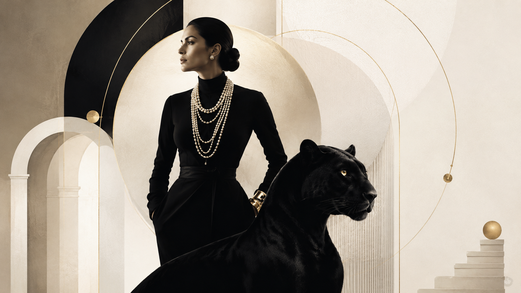
The most powerful symbols in branding were never designed to be symbols. They were chosen because something true lived inside them — and that truth, repeated with precision, became impossible to ignore.
What most people think a symbol is
Ask a room of marketing directors what their brand symbol is, and most will point to the logo. Some will mention a colour. A few will bring up a typeface. These are not wrong answers — but they are partial ones, and the partial answer is where most brand-building quietly fails.
A symbol, in the fullest sense, is not a mark. It is a concentrated point of meaning. It works because every encounter with it activates something larger than itself — a feeling, a memory, an expectation, a promise that the brand has spent years earning the right to make. The logo is just the surface. What makes it function as a symbol is what has accumulated behind it.
This distinction matters because it changes the question. Most briefs ask: what should our symbol look like? The better question is: what should our symbol carry? Those are not the same question, and conflating them is how brands end up with sophisticated visual identities that communicate nothing in particular.
The two that prove the point
Cartier has its panther. It appeared on the jewels as early as 1914, sketched first by Louis Cartier, and it has never left. Not because big cats are universally admired, but because the panther embodies something specific: it is elegant and dangerous simultaneously. It moves with precision. It does not need to announce itself. This is exactly what Cartier wants you to feel about its jewellery — that it belongs to a world where quality is assumed, not explained, and where the person wearing it understands something other people do not.
The symbol works because the brand earns it. Every boutique, every campaign, every choice about where the jewellery appears in the world reinforces the same set of values. The panther is not decorating the brand. The brand is the panther.
Chanel's relationship with Coco herself is a different kind of symbol — a human one. When Chanel reaches for its founder, it is not doing nostalgia. It is doing argument. Gabrielle Chanel was a woman who dressed herself in what she found comfortable and called it fashion, who took men's fabrics and gave them to women, who built independence into the cut of a jacket. The stories Chanel tells about her are consistently about freedom, courage, and a refusal to be defined by other people's expectations. This is the brand's positioning, stated not in a values document but in the life of a woman who actually lived it. The symbol has evidence. That is why it holds.
Finding your own — the actual work
The most common mistake brands make when they go looking for their symbol is beginning with aesthetics. They study what competitors look like, hire a visual identity studio, and try to find something "distinctive." Distinctiveness is necessary, but it is not sufficient, and it is not the place to start.
The right starting point is an honest excavation of what the brand actually believes — not what it says it believes in its brand guidelines, but what it has consistently done under pressure. What has it refused? What has it protected when protecting it was expensive? What does it keep returning to, even when nobody asked it to? The symbol should come from that place, because that is the place where truth lives.
Once you have that — and it usually takes more honesty than brands expect — you look for a form that can hold it. This is not a visual brief yet. It is a search for the right kind of image, the right archetype, the right register. A luxury jeweller and a challenger fashion brand might both value freedom, but freedom takes a completely different form in each context. The panther is not the right symbol for everyone. The question is what your specific version of your specific truth looks like when given a shape.
Then comes the visual brief — and here the instruction to a designer changes. Instead of "make it feel premium" or "make it feel warm and modern," the brief becomes: this is what this symbol must communicate, this is the feeling it must leave, this is what someone should understand about us from this mark alone. That brief produces better work than any mood board.
Execution is where this thinking either becomes real or stays theoretical. The symbol needs to appear in enough places, with enough consistency, over enough time, for the association to form. This is not about saturation — it is about coherence. Every time the symbol appears in a context that contradicts what it is supposed to mean, it weakens. Every time it appears in a context that confirms its meaning, it strengthens. This is what brand management actually is, in practice: protecting the conditions under which the symbol can do its work.
Where it goes wrong, and why
The most tempting mistake is choosing a symbol based on what is beautiful rather than what is true. This is understandable — beauty is easier to see, easier to agree on, easier to present in a board meeting. Truth requires a harder conversation. It requires admitting what the brand is actually about, which sometimes conflicts with what people in the room wish it were about.
The result is a visual identity that is genuinely attractive and entirely unmemorable. It looks correct. It passes all the aesthetic tests. It has no soul. And six months after launch, the team is already discussing a refresh.
You can usually tell this has happened when the brand's symbol could belong to a different brand in the same category without anyone noticing. If you cover the name and the symbol could be anyone's, the work has not been done. A symbol earns its place by being not just recognisable but irreplaceable — by being the only form that this particular truth, belonging to this particular brand, could take.
The second failure mode is inconsistency of nerve. A brand finds its symbol, believes in it, launches it — and then softens it at the first sign of resistance. A panther feels too aggressive for the new season. Coco feels too complicated for the Asian market. And so the symbol gets diluted, deployed selectively, explained rather than trusted. Explanation is always a sign that something has gone wrong. A symbol should not need a caption.
What Yasuragi understood
Yasuragi, the Japanese spa outside Stockholm that has worked to hold a genuinely distinct position in the Nordic market, offers a useful example of this thinking made visible. The brand's identity does not borrow from Japanese aesthetics in a decorative way — it does not simply use bamboo motifs and call the work done. The visual language is a commitment: this is a place where the logic of Japanese ritual hospitality, which is fundamentally about attention, slowness, and the dignity of the guest, is taken seriously.
That commitment carries only because it is consistent. The architecture holds it. The service holds it. The language the brand uses holds it. The symbol — in the widest sense, the whole register of the brand's communication — is coherent because the brand has decided what it believes and has not since changed its mind under competitive pressure. That coherence is what makes the position defensible. Any spa can claim relaxation. Very few can claim a worldview, and fewer still can show that they mean it.
The first move to make on Monday
Before any visual work, before any brief to any designer, ask the question plainly: what has our brand protected when protecting it was difficult? Not what do we say we stand for — what have we actually refused? What have we kept, even when keeping it cost us something?
Write the answers down. The symbol is in there somewhere. It may not be obvious immediately, and it will almost certainly not arrive looking the way you expected. But it will be true. And a symbol that is true is one that can be trusted with the brand's future, because it is made of the brand's past.
Once you have that answer, you can brief the visual work — not to create something distinctive, but to create something that holds what is real. The distinction is slight. The difference in outcome is everything.
---
At BBMB, the search for the symbol — the panther, the founder, the form that carries the soul — is where we begin most brand conversations. Not because it is dramatic, but because everything else follows from it. A mark that holds the truth of a brand is not a design problem. It is a clarity problem. And clarity, in our experience, is always worth the work.