Environments that market themselves
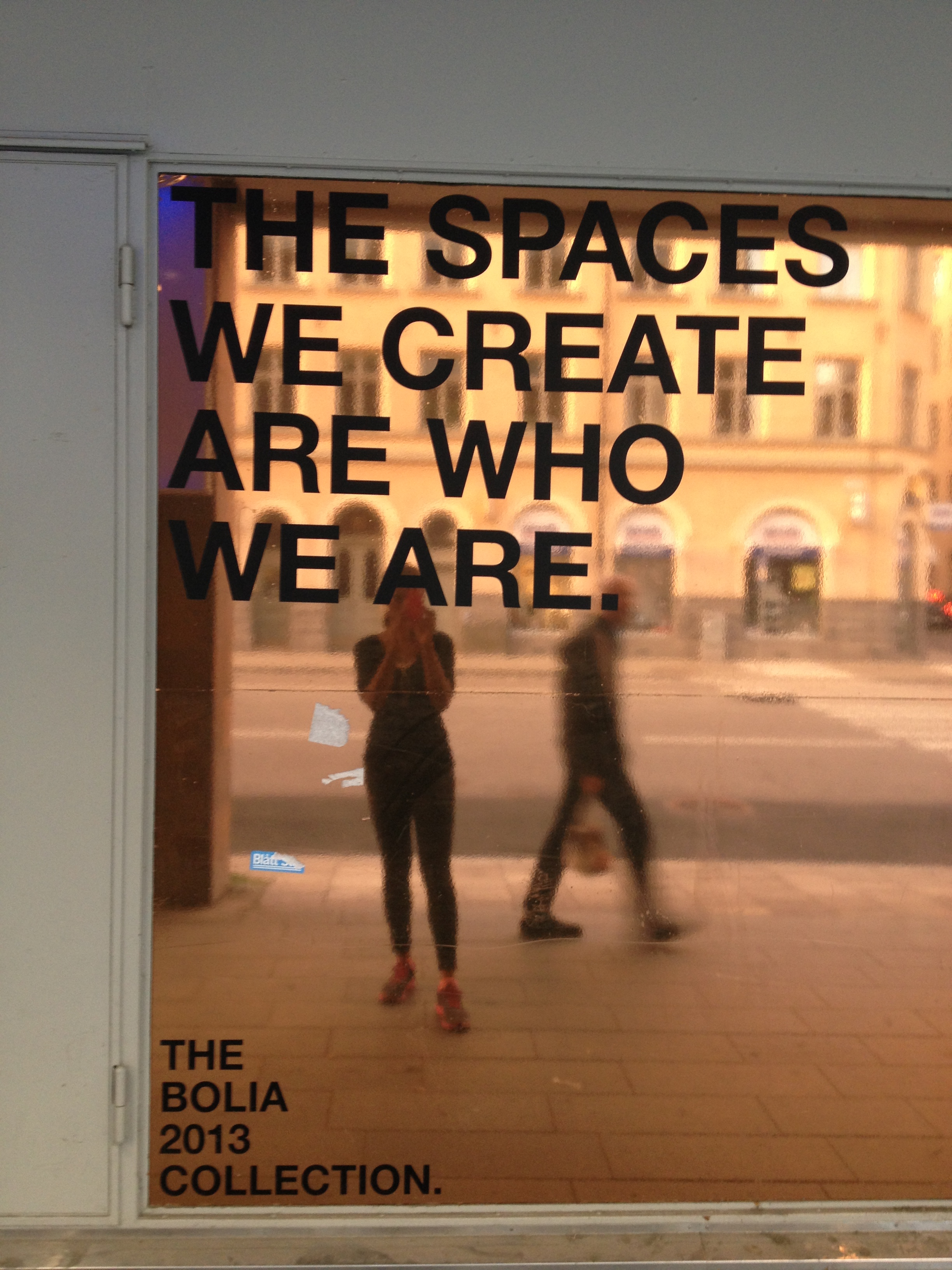
The most powerful PR a brand can generate is the kind it never has to ask for. When a space is built correctly, people document it without prompting — and the distribution follows.
What most brands get backwards
There is a persistent assumption in brand marketing that visibility is something you pursue. You brief an agency, you set a budget, you build a campaign. You distribute, you target, you optimise. The logic is that attention must be captured — and that capturing it is an active, outward effort, something a brand does *to* the world.
The assumption is not entirely wrong. But it misses something that the best-performing brands have understood for some time: the most durable distribution is pull, not push. It is created not by broadcasting but by building something worth broadcasting about. And increasingly, that something is a place.
We have arrived at a moment where a physical environment — a shop floor, a hotel lobby, a restaurant interior, a pop-up — functions as a media channel in its own right. Not because brands have installed backdrops and hashtag signs, but because people carry cameras everywhere and use them constantly to narrate their lives. The question is no longer whether your space will be photographed. It will. The question is whether the photograph will say something useful about who you are.
The logic behind environments that earn their own reach
To understand why some spaces get documented and others don't, it helps to think about what photography actually is — not mechanically, but socially. When someone photographs a place and shares it, they are borrowing the place's identity to say something about their own. The image is theirs, but its meaning comes from yours. That transfer only happens when the place carries enough cultural or aesthetic charge to be worth borrowing.
This is why a beautifully lit corner in a well-considered interior travels further than a sign that says "share your experience." The sign creates friction. It makes the transaction visible, which makes it feel transactional. The corner simply exists — and people respond to it as they respond to anything genuinely beautiful: they want to hold onto it. The photograph is not a marketing act for them. It is a personal one. The marketing effect is a byproduct.
What this means in practice is that the space has to be genuinely good. Not good for its category, not good considering the budget, not good in a way that requires explanation. Good in the way that a stranger walking in cold would feel it immediately. That is a high bar, and it is the right bar, because the audience is always strangers — and strangers are ruthlessly honest with their cameras.
How to build it: the decisions that actually matter
The first decision is not aesthetic, it is editorial. Before you think about a single lamp or a single surface, you need to know what one thing this space should make someone feel within the first thirty seconds of entering. One thing. Not "premium and welcoming and playful and Scandinavian." One thing — the sharpest, most specific emotional note you want struck. Everything that follows is in service of that note, or it is noise.
The second decision concerns light. Not as decoration, but as structure. Light determines what is noticed, what is ignored, and how long someone stays. Warm, directional light creates intimacy; it slows people down, which gives them time to see. Flat, even light erases depth and accelerates the feeling that there is nothing to discover. A space that looks flat in person will look dead in a photograph. The camera is not forgiving of light that has not been considered — and a photograph taken in poor light will not be shared, which means the space is invisible to everyone who was not already there.
The third decision is scale and proportion — specifically, what is at eye level and what is not. This is the decision most often made by the person doing the fixtures, not the person doing the brand, and it shows. What sits at eye level is what gets photographed. If it is a price tag or a storage unit or a poorly merchandised shelf, that is what travels. If it is something that embodies the brand at its most precise — a material, a colour, an object with a story — that is what travels instead. This is not about creating Instagram moments. It is about ensuring that the visual logic of the space, at the level where cameras naturally point, is coherent with what the brand is trying to say.
The fourth decision is restraint. The spaces that photograph best almost always have less in them than the brand initially wanted. Every additional element competes for attention; every competition for attention dilutes the dominant feeling. Removing something that is perfectly fine is harder than adding something excellent, and it matters more.
Once these decisions are made in order — emotional note, light, eye-level content, restraint — then the smaller choices can follow: material selection, colour relationships, the handling of transitions between zones, the quality of the details that reward a closer look. These details matter, but they cannot compensate for a weak answer to any of the four structural decisions. A beautiful tile behind a cluttered, flat-lit shelf is invisible.
The mistake worth naming
The most common error brands make when they hear this logic is to build a "photo moment" — a wall, a corner, a set-dressed vignette, designed specifically to be photographed, sitting in contrast to an otherwise unconsidered space. You have seen these: a neon sign over an otherwise ordinary reception desk, a flower installation beside a bare stairwell, a geometric mural at the entrance of a shop whose interior has never been touched.
The temptation is understandable. A photo moment feels like a shortcut — you get the shareable content without having to think about the whole space. But it creates exactly the wrong signal. It tells anyone paying attention that the brand knows what a good environment looks like and chose not to make one. Worse, the photographs it generates are eventually recognisable as the product of a formula. The audience learns the template, and the template stops working.
A brand knows it has made this mistake when the photographed corner and the actual experience of being in the space have nothing to do with each other. When customers who visit after seeing the image feel misled. When the image travels but the brand does not benefit — because the association in the photograph is with a prop, not with a place that is meaningfully yours.
An example worth studying
Consider how Yasuragi, the Japanese-inspired spa resort outside Stockholm, operates as a space. There is no single photo moment. The environment is built around a consistent, deeply held logic — materials, light, proportion, silence — that runs through every part of the property, from the entrance to the baths to the guest rooms to the food. A person photographing almost anywhere on the property captures that logic, because it is genuinely there, in every direction. The photographs that circulate from Yasuragi are varied in their content but coherent in their feeling. They are recognisable as Yasuragi without a logo in frame. That coherence is not a styling decision. It is a brand decision, made early, held firmly, and expressed spatially.
This is what it looks like when an environment markets itself. Not one good corner — a totality that earns documentation at every point, because the thing being documented is real.
Where to begin
If you are standing at the beginning of a project — a new location, a renovation, a pop-up — the first step is to write a single sentence that answers this question: when someone who has never heard of this brand walks out after visiting, what should they say it felt like?
Not what they should think. Not what they should know. What they should feel. Write that sentence before you look at a single mood board. Take it into every decision that follows and use it as a filter. When something does not serve that sentence, it does not belong in the space, regardless of how much it costs or how much someone loves it.
Then, once the space exists, walk through it with a phone — not a professional camera, a phone, because that is what your visitors will use. Photograph at the height and angle of someone who has stopped because something caught their eye. Look at what the photograph shows. If it shows your brand clearly, you have built something worth building. If it shows clutter, or a logo, or a sign asking for engagement, you have more work to do.
The test is simple. The work behind it is not. That gap is where brand thinking earns its place.
---
At BBMB, the spaces we work on are shaped by the same logic that shapes the brands behind them: one clear idea, held consistently, made physical. The work is quiet. The distribution tends to take care of itself.